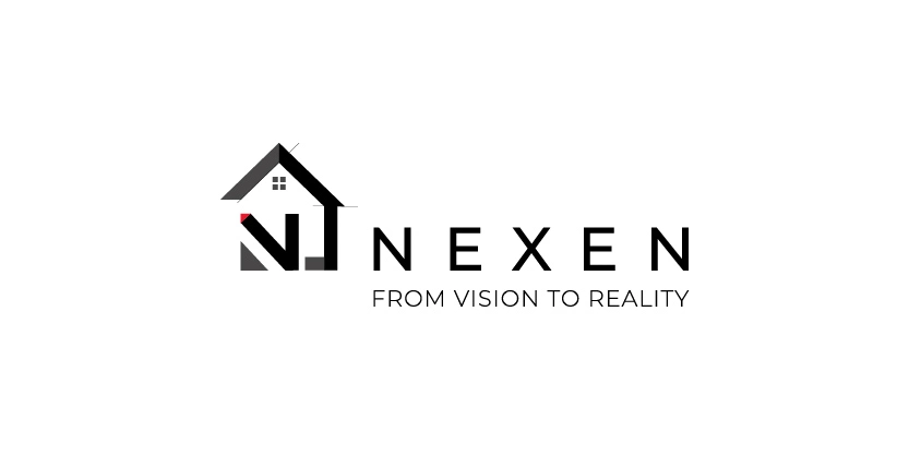
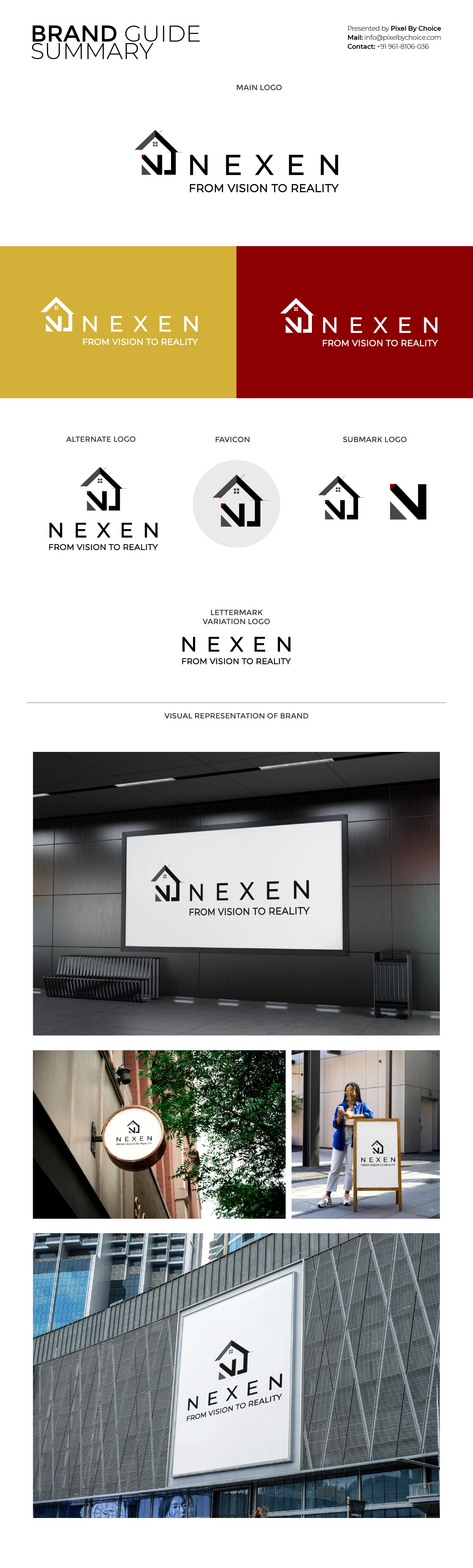
Branding Analysis: NEXEN
A Bold and Industrial Identity
The Nexen logo perfectly encapsulates the essence of a strong, reliable, and
future-driven construction brand. Its bold typography exudes confidence and stability,
reflecting the company's expertise in the construction industry. The design conveys
precision and durability, essential qualities for a company that builds with excellence.
The color scheme is well-chosen, aligning with the industry’s standards of trust and
authority. Whether displayed on construction helmets, blueprints, or business cards, the
logo maintains its professional and commanding presence.
Overall, the Nexen logo is a powerful visual identity, reinforcing the brand’s
experience, commitment, and leadership in the field of construction and contracting.
Clients