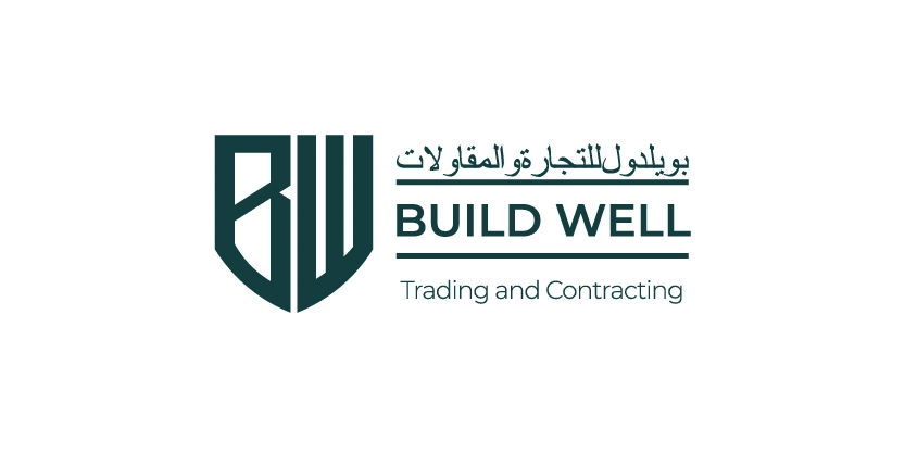
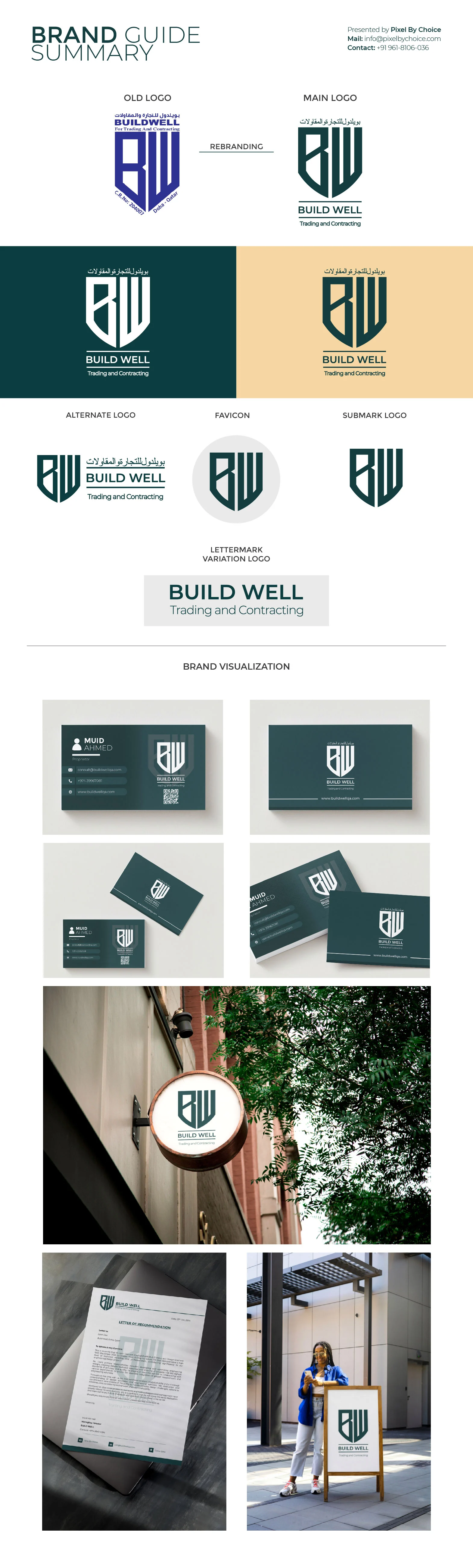
Logo Evolution: Build Well Trading and Contracting
The new logo represents a significant upgrade in professionalism, balance, and brand clarity. While the old logo had a strong and recognizable shield shape, the new design refines that identity, making it more modern, structured, and adaptable across various platforms.
Monogram Analysis: Old vs. New
Old Monogram: The "BW" monogram was bold but lacked refinement, with
uneven spacing and less visual balance. The sharp angles gave a sense of strength, but
the overall execution felt a bit dated and rigid.
New Monogram: The monogram retains its boldness but is now more
refined. The letters "B" and "W" are seamlessly integrated within a shield, ensuring a
more cohesive and symmetrical look. The structure enhances trust, longevity, and
stability, which is essential in the construction industry.
Typography & Readability
Old Logo: The text was in uppercase with a traditional serif font,
making it formal but somewhat generic. The alignment and spacing also felt inconsistent,
which affected readability.
New Logo: The typography has been upgraded to a more modern,
professional, and elegant typeface. The "Build Well" text now appears structured, with a
clear hierarchy, enhancing brand recognition. The use of horizontal lines in the Arabic
text and English text improves visual flow.
Color Psychology & Branding
Old Color Palette: The old logo was a basic blue, which signified trust
but lacked versatility and premium appeal.
New Color Palette: The new branding introduces a sophisticated deep
green and gold/beige combination.
Dark Green – Represents growth, stability, and reliability—ideal
for a construction company.
Beige/Gold – Adds a premium, timeless, and high-end feel to the
brand.
Black & White Versions – These variations ensure high adaptability
across branding materials.
Scalability & Versatility
Old Logo Issues: The previous design struggled with adaptability across
various branding materials. The detailed text and compact elements made it harder to
scale down without losing clarity.
New Logo Solution: The refined design is highly scalable, making it
usable on small digital icons, large billboards, corporate documents, and construction
gear. The monogram itself can work as a standalone brandmark, adding flexibility to
branding.
Professional & Timeless Identity
The new logo successfully conveys strength, trust, and longevity, aligning with Build
Well’s identity as a construction company. The cleaner execution ensures the brand
stands out as a premium, professional, and industry-leading company while maintaining
its core identity.
Final Verdict:
✅ More Professional
✅ Stronger Brand Identity
✅ Better Readability & Scalability
✅ Enhanced Trust & Boldness
This logo transformation represents a strategic upgrade, ensuring Build Well continues
to stand out with a timeless, trustworthy, and visually impactful brand identity.
Clients